Text Blocks
If you’ve read the article on Image Blocks, this will seem very familiar to you. They’re very similar tools, reached in similar places, but the specifics of how you set them up vary.
Pinnion uses a feature called “blocks” to place additional text and pictures in your surveys. The type of blocks used for text is called “Text Blocks.” Let’s look at how text blocks work. First, go to your Pinnion and look at the screen you’d like to add some text to.
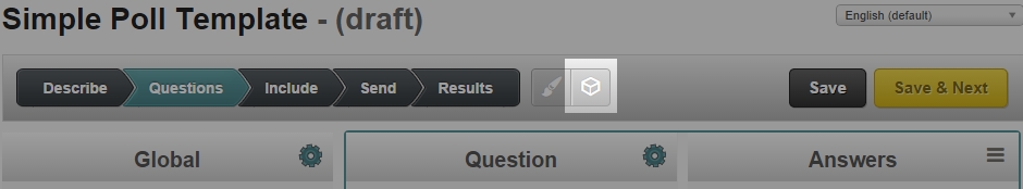
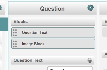
There’s a button at the top of the screen that looks like a 3D box. Click this button to create a new block.
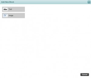
You’ll see a screen with two buttons for “Text” and “Image,” and a cancel button. This screen lets you pick which type of block you’d like to create. Image blocks can be used to locate and precisely alter how images are displayed. For now we’re working on text blocks, so click “Text.”
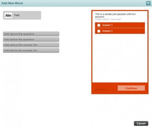
You’ll see a preview of your screen and four buttons. On the questions page these will be “Add above the question,” “Add below the question,” “Add above the answer list,” and “Add below the answer list.” When you mouse over one of the buttons, it will display an arrow showing where on the screen your text will appear. You can move your text block later, but try to put it as close to where you want it as possible.
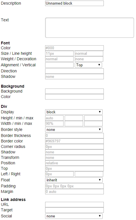
There’s a lot going on on this page, so I’m going to go through it from top to bottom.
- Description: This is where you enter a name for your text block. This is what you’ll see in the list of blocks for the screen, so pick a name that will let you figure out which block it is at a glance.
- Text: Here you define exactly what text appears in the block. You’ll be able to alter it later.
- Font: This section defines how your text is displayed.
- Color: Sets what color your text is. You can enter html color codes (this site will allow you to pick them easily if you’re not familiar: http://html-color-codes.info/), or the names of colors (like red, blue, yellow, orange).
- Size: Sets the font size of your text, in pixels.
- Line Height: Sets how tall the lines are in your text, in pixels. A higher number will result in a greater separation between lines and between the rest of your survey.
- Weight: How bold your text appears. Your options are:
- Normal: Normal font weight.
- Bold: Bolded, thicker font weight.
- Bolder: Even bolder, more thick font weight.
- Background: This section defines a background that appears in the area your text is restricted to.
- Background: The Background field is a complex tool that lets you control exactly how a background is displayed. Unless you’re familiar with CSS, it’s recommended that you leave it alone.
- Color: Allows you to set a color for the background of your text, in the same was as the text color above.
- Div: This section controls details about where your text is located.
- Display: Display has a few options that determine how your text is placed and presented.
- block: Standard. Displays your text in a separate “block” of the screen, or paragraph break. Usually means your text will be displayed on its own line, separate from other elements.
- inline: Displays on the same line as other inline elements preceding it.
- inline-block: Similar to inline. In most functionality, it will only display on the same line as other inline-block elements.
- list-item: Displays in a vertically separated list. Useful if you want to have a bulleted list.
- flex: Similar to block. Don’t bother with it unless you’re an advanced user.
- inline-flex: Similar to inline-block. See flex.
- Height and Width: These sections control how tall and wide the area your text is bound to is. “auto” will automatically pick a value that gives it an appropriate margin. You can also enter a percentage (such as 50%) and Pinnion will scale the section to be a percentage of the height or width of your survey. Numbers should be accompanied by “px” for pixels, “in” for inches, or “cm” for centimeters, depending on how you want to determine the size of your text box. If you don’t enter a type of unit, Pinnion will use pixels. For example, a text box with a width of 100px will be scaled to be 100 pixels wide, while a text box with a width of 3in will be scaled to be 3 inches wide.
- Border Style: Determines what type of border will be created. The options are: dotted, dashed, solid, double, groove, ridge, inset, and outset.
- Border Thickness: Determines how thick the border around your text will be. Leave this at 0 if you don’t want a border. Use “px”, “in”, or “cm” here as well.
- Border Color: Determines the color of your border, defaulting to gray. You can either enter an html color code or the name of a color (like red, blue, or green). If you’d like to try using html color codes, this site can help you create them easily: http://html-color-codes.info/
- Corner Radius: Corner Radius determines how round the corners of the border are. A higher number results in a more round border.
- Shadow: This box can be used to add a shadow to your text. Shadows are created with the following format: horizontal vertical blur spread color. Horizontal and vertical determine how far away your shadow is from the text. Blur determines how ‘blurry’ your shadow appears; a low value appears more sharp, while a high value looks more like a cloud. Spread determines the size of your shadow. Color determines what color your shadow is. For horizontal, vertical, blur, and spread, use distances like in Height and Width above. For color, use either the name of a color or an html color code. For example, “5px 5px 50px 5px black” would result in a black shadow 5 pixels down and to the right from the text, with a blur of 50 pixels, 5 pixels larger than the text.
- Transform: The transform function is primarily useful for images. Most of its functions are not usable for text, including the easier options detailed in the image block article.
- Position: Determines the default position for your text box. The options are:
- Static: Appears in its normal location for where you decided to place it. Can’t be moved by the Left or Top properties below.
- Absolute: Appears in the normal location for where you decided to place it, in the first available space (usually this means on the left side of the screen), ignoring any margins.
- Fixed: Appears in the top left corner. This option makes it easier to put the text at a specific spot on the screen.
- Relative: Same as Static, but its position can be altered by the Left and Top properties below.
- Top: Determines the location of the top edge of your text and pushes it down.
- Left: Determines where the left edge of your text is, horizontally, pushing it to the right with positive values. You can enter a distance (px, in, or cm), percentage (of the screen), or auto. Auto will leave your text centered.
- Right: Just like Left, but it pushes your text left instead (determining where the right edge of your text is horizontally).
- Padding: Clears an area around the text, inside of any border (or where a border would go). This area displays the background of your screen. You can set it in any of these ways, using either distances or percentages.
- 1 value (5px): The same value is used for padding on all edges.
- 2 values (5px 10px): The first value is used for the top and bottom, and the second value is used for the left and right.
- 3 values (5px 10px 15px): The first value determines the top padding, the second value determines the left and right paddings, the third value determines the bottom padding.
- 4 values (5px 10px 15px 20px): The first value determines the top padding, the second the right padding, the third the bottom padding, and the fourth the left padding.
- Margin: The margin clears an area around the text outside the border. It is defined in the same way as padding, except that you can use ‘auto’ to allow the browser to determine a margin (usually centering).
- Display: Display has a few options that determine how your text is placed and presented.
- Link Address: This section is for if you want to use the text as a link.
- URL: The URL of whatever you want your text to link to. People clicking on your textwill be directed to this URL.
- Target: Determines where the link gets opened. The options are:
- _blank: Opens the link in a new tab or window when clicked. Most generically useful option.
- _self: Opens the link inside the survey frame. This is likely not very useful to most users, but is available regardless.
- _parent: Opens the link in the frame just outside of the survey. This is likely not very useful to most users, but is available regardless.
- _top: Opens the link in the window or tab it’s clicked in. This will take users away from your survey, so be careful where you use it.
- Framename: Opens the link in a specifically named frame. Only use this if you really know what you’re doing already!
- Social: This dropdown box is used to create social blocks. See our article on social media sharing for more information.
Now that you know what all the different options can be used for, set them to position and format your text how you’d like. Now press the “Add” button in the bottom right corner, and your text block will be created in the Blocks section you added it to.
You can click the block here to edit it if you want to change something you set earlier, click and drag the dots on the left to move it to a different section (or even a different question), or press the green plus or red x if you want to duplicate or delete your block, respectively.